
https://www.etsy.com/listing/90486969/75-off-neapolitan-pink-brown-white
I felt a certain amount of pressure to come up with a really amazing baby book for my daughter, considering my business. But when I finally sat down to do it (yes, even pros can procrastinate), I felt really creatively stuck. I found a set of digital papers/backgrounds that I really liked, but nothing was “clicking”. I had all the photos and text laid out, but no matter how I arranged the page, nothing looked right to me.
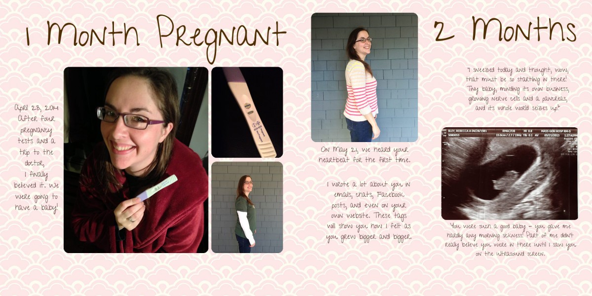
First, I tried using a pretty pink background, but it swallowed my text and overwhelmed the images:
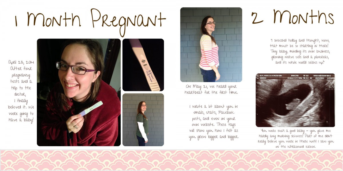
 Next, I tried lightening up the background by adding a white layer on top of it and adjusting opacity:
This was better. I could read my text again, and the paper was looking elegant and light. But the page still didn’t … pop. There was something missing. I nearly scrapped the whole layout, but instead I stepped back and took a tour through pages and backgrounds that I liked in other designers’ albums. I tried to figure out what was so appealing about them. One pattern I started to see was the use of smaller patterned elements on solid backgrounds. But I liked the neapolitan papers I had found, and the designer didn’t sell coordinating elements.
What’s a stubborn girl to do? Make her own elements! I cropped down the paper to become a ribbon instead.
 With this version of things, I actually noticed the pretty pattern even more. It still left too much white space, however. Even making the background a light pink color wasn’t enough for me. Finally, I started playing with the Matte feature in FotoFusion. This function will “cut” an image into various shapes. I decided to use a “tag” shape to demarcate the two different kinds of text in the album. Quotes I had copied from emails and posts written during my pregnancy would be on tags, and text I was writing while creating the album would stand on its own. The color became too dark on these tags, so here is where I used my white layer to make sure the text was still readable. I also zoomed out on the pattern to make the design relatively smaller and less overwhelming.
For a finishing touch, I decided that the number of “months pregnant” on each spread would be marked with a button (a circle-shaped matte of the patterned paper).
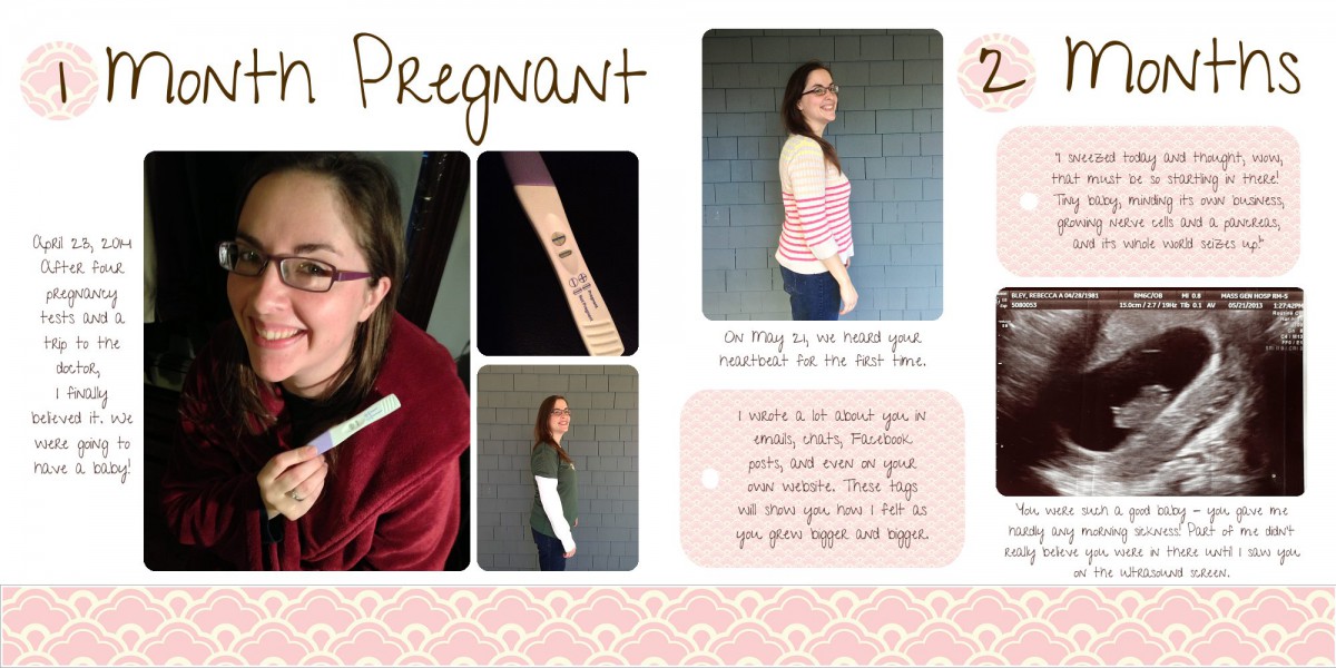
Ta-da! My spread finally came together. I used these techniques throughout the album, ensuring that I could use even extremely busy backgrounds without creating busy pages. I also faked my way into a coordinated set of backgrounds, ribbons, tags, and buttons 🙂
P.S. – AestheticAddiction, the designer who created the original papers, is currently having an amazing sale – entire packs of digital paper for $1.00 each! I only stumbled on the sale when I went back to find a link to this pack, and I immediately filled up my cart. I’ve already got half a dozen sets from her, and I love how they coordinate. Check her out!


